
Designing From the Floor Up: How Flooring Creates Color, Comfort & Flow
A flooring-first interior design guide for building a home that feels connected, layered and intentional.
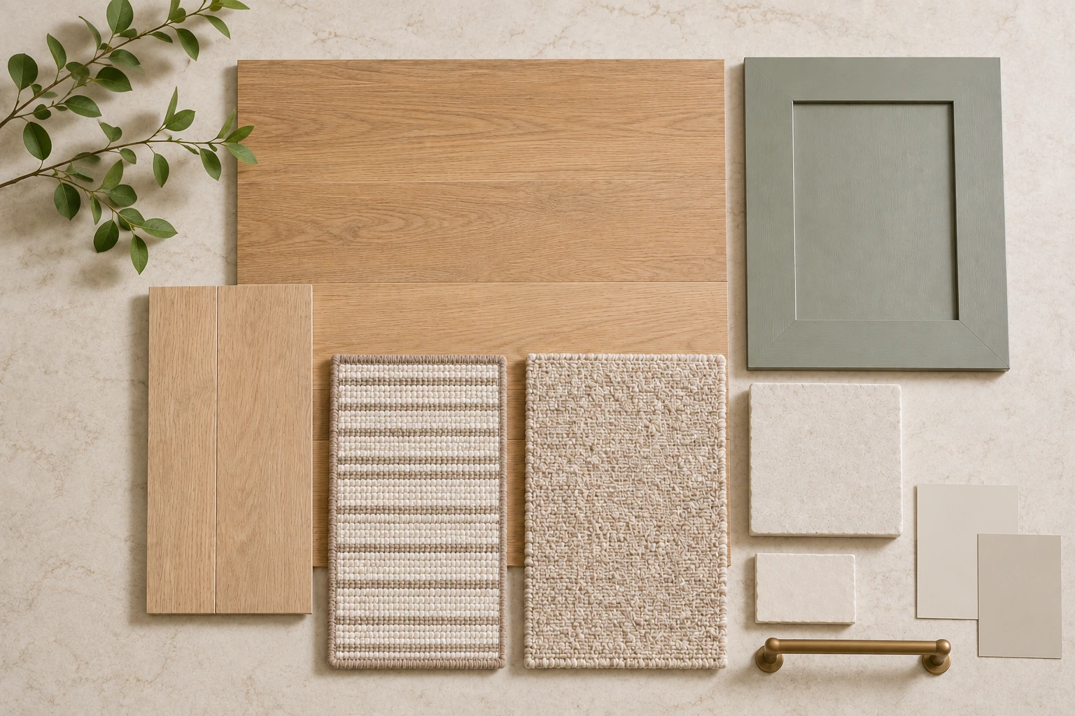
A room can have beautiful furniture, paint and lighting and still feel slightly disconnected. Often, the missing piece is the floor. Flooring sits beneath every other element in the room, so its color, texture, pattern and scale quietly influence the way the entire interior is read.
Instead of treating flooring as a final construction choice, use it as the starting layer of the design. Once the floor feels right, it becomes easier to coordinate carpet, area rugs, cabinetry, countertops, wall colors and the transition from one room to the next.
This guide focuses on the design side of flooring: how to build a palette that feels intentional while still choosing materials that suit real life in Rockville, Bethesda, Potomac, Chevy Chase, Silver Spring, Gaithersburg and the Washington, DC area.
1. Choose the Floor Before the Decorative Layers
Paint can be changed. Pillows can be replaced. Flooring is a long-term surface, so it deserves to be selected earlier in the process. Starting with the floor helps prevent a common problem: choosing several finishes you love individually, then discovering that their undertones or visual movement compete once they are placed together.
A practical selection sequence is:
- Flooring and other large fixed surfaces
- Cabinetry and countertops
- Tile and backsplash materials
- Paint colors
- Carpet, area rugs and upholstery
- Lighting, hardware and finishing details
| Carpet Palace design note: If you already own an important rug, heirloom piece or cabinet finish, bring it into the process early. A “floor-first” plan can still begin with an existing element that the room needs to honor. |
2. Think in Undertones, Not Just Color Names
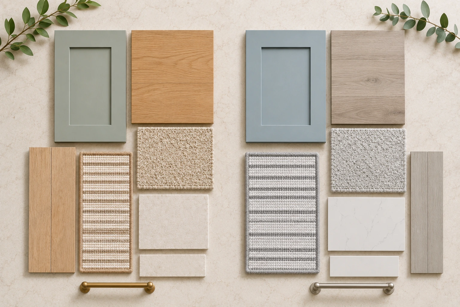
“Beige,” “brown,” “gray” and “white” are broad labels. Two materials with the same label can look surprisingly different together because of undertone. One may lean golden, another pink, green, violet or blue.
Instead of trying to make every material match, look for a relationship. A warm oak floor can work beautifully with ivory walls, mushroom cabinetry and a soft taupe carpet because the materials share warmth without becoming identical. Controlled contrast usually looks more intentional than an almost-match.
3. Let Texture Decide How Formal or Relaxed the Room Feels
Color gets the most attention, but texture often determines the mood. Smooth, refined surfaces can feel tailored and formal. Wire-brushed wood, visible grain, loop carpet and hand-tufted rug textures bring depth and a more relaxed, collected quality.
For hard flooring, sheen matters too. Matte and low-luster finishes tend to feel softer and more natural. Higher sheen reflects more light and can feel dressier, but it can also make dust and small surface marks more visible.
Carpet changes the room in a different way. A plush cut pile can make a bedroom feel quiet and enveloping, while a patterned loop or tailored woven look can give stairs, libraries and formal rooms more structure.
4. Use Plank Width, Rug Scale and Pattern to Shape the Space
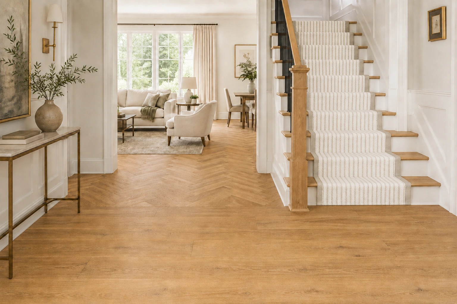
Scale changes how a room feels before you notice any individual color. Wide planks reduce visual seams and can make an open space feel calmer. Narrow planks create more rhythm. Herringbone introduces movement and works best when nearby materials have enough restraint to let the pattern breathe.
The same principle applies to carpet and rugs. A tiny motif can become busy across a large staircase, while an oversized pattern may disappear on narrow treads. For area rugs, the pattern should be judged at the size the room will actually use—not only from a small sample.
5. Coordinate Hard Flooring and Rugs Instead of Treating Them Separately
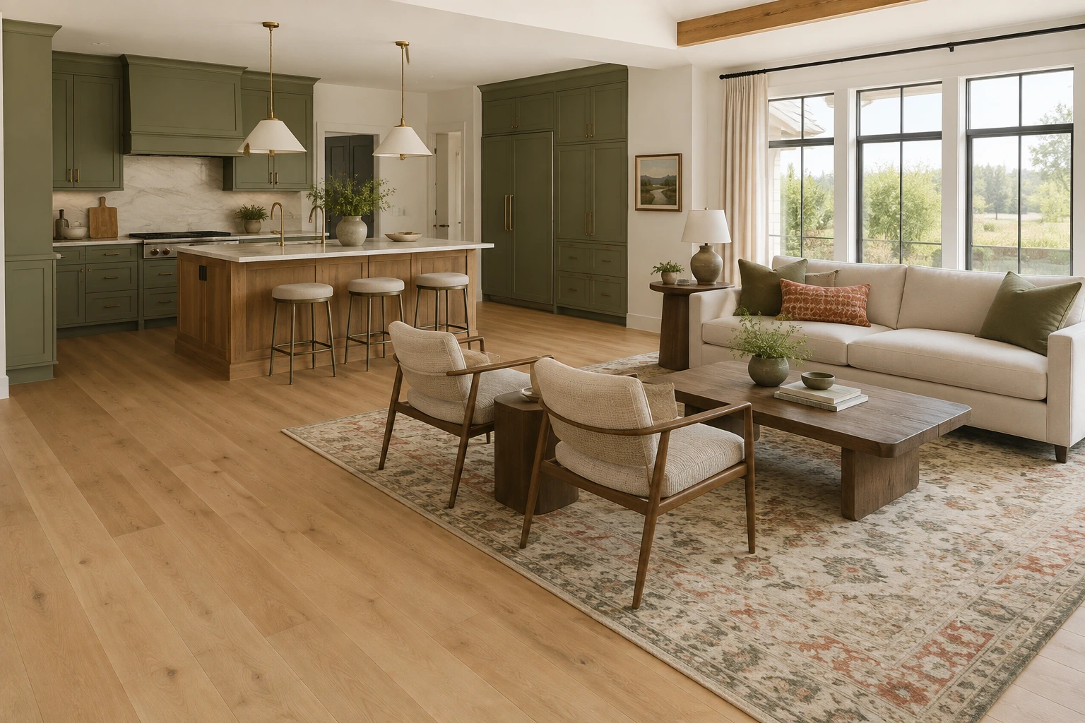
An area rug is not an accessory that simply sits on top of the floor. It becomes part of the flooring composition. The hard surface provides continuity; the rug defines a zone, softens acoustics and introduces color or pattern.
The strongest pairings usually have enough contrast to make each material visible. On a medium warm wood floor, an ivory, olive, rust, muted blue or softly patterned rug can create separation without feeling disconnected. On pale flooring, a deeper or more textural rug can give the room visual weight.
If the floor already has strong grain or color variation, consider a calmer rug. If the floor is visually quiet, the rug can carry more of the pattern.
Explore Carpet Palace area rugs alongside the flooring sample so color, pile and pattern scale can be judged together.
6. When Wood Meets Wood, Choose Contrast Over a Near Match
Wood flooring next to wood cabinetry can look rich and layered, but trying to match the two exactly is rarely necessary. Slightly different woods that are too close in color can look accidental. A clearer difference in value or grain usually works better.
For example, a natural oak floor may sit comfortably with a medium walnut island when both share a warm base. Painted cabinetry can also give character-rich hardwood room to stand out without adding another competing wood pattern.
Compare species, finishes and plank character in Carpet Palace hardwood flooring before finalizing nearby cabinetry and furniture.
7. Use Carpet to Create Comfort Without Breaking the Color Story
A cohesive home does not need one flooring material everywhere. Carpet can be the intentional softer chapter in a whole-home palette—especially in bedrooms, family rooms, stairs and upstairs levels.
The transition works best when the carpet relates to the hard flooring through undertone or value. A warm natural wood floor can move into a mushroom, oatmeal or taupe carpet without feeling abrupt. Patterned carpet can also connect to a nearby rug or upholstery color while giving the room its own identity.
See Carpet Palace carpet flooring for wall-to-wall carpet, patterned options and custom binding for area rugs and stair runners.
8. Make Transitions Feel Architectural, Not Accidental
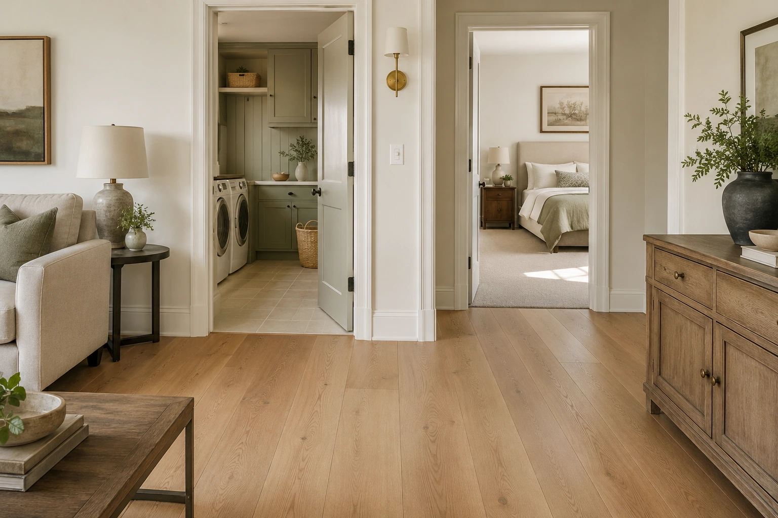
Changes in flooring should happen for a reason: a doorway, a change in function, a stair, a wet area or a shift from public to private space. When several flooring types are visible from one viewpoint, the home can feel fragmented unless the transitions are carefully controlled.
A simple way to maintain flow is to repeat one visual idea across the materials. That might be a warm undertone, a similar level of contrast or a quiet textural quality. Hardwood can transition to a related taupe carpet or a wood-look resilient floor without copying the same surface exactly.
9. Test the Palette in Real Light
Showroom lighting is useful for comparing products, but your home decides how the final palette will look. Daylight direction, bulb temperature and nearby colors can change the way a floor reads. A neutral sample may look warmer beside cream walls or cooler beside a blue-gray cabinet.
Bring the core materials together and look at them in the actual room at different times of day. Place flooring samples horizontally, hold cabinet and wall samples vertically, and step several feet away. The combination should still feel balanced from a normal viewing distance.
10. Build a Complete Material Story Before You Order
The goal is not to find seven exciting samples. It is to create one strong composition. A quieter floor may be the right answer when the countertop has dramatic movement. A simple cabinet may support a patterned runner. A calm rug may be exactly what a character-rich hardwood floor needs.
| Layer | What to Compare | Design Goal |
|---|---|---|
| Flooring | Undertone, grain, sheen, plank or pattern scale | Establish the visual foundation |
| Carpet / Rug | Fiber, pile, texture, repeat, edge detail | Add softness and define zones |
| Cabinetry | Wood tone or paint color, door style | Create clear but related contrast |
| Countertop | Base color, veining, movement | Decide which surface leads visually |
| Tile | Format, grout, texture, pattern | Connect the palette or add a purposeful accent |
| Paint | Undertone and light response | Support the fixed finishes |
| Metal / Lighting | Finish temperature and contrast | Repeat or sharpen the palette |
Common Design Mistakes to Avoid
- Choosing paint before fixed materials.Paint is easier to adjust than flooring, cabinetry or stone.
- Trying to match every wood exactly.A deliberate contrast often looks more sophisticated than a near match.
- Ignoring pattern scale.Carpet repeats, rugs and veining need to be judged larger than a sample card.
- Using too many statement surfaces.Let one or two materials lead and give the others room to support them.
- Forgetting comfort and maintenance.A beautiful palette still has to work for traffic, pets, sound and everyday cleaning.
- Treating transitions as an afterthought.The point where two floors meet is part of the design.
Frequently Asked Questions
Should flooring be lighter or darker than cabinets?
Either can work. What matters more is undertone and enough contrast to make the relationship look intentional. When both surfaces are wood, a visible difference in value usually works better than an almost-match.
Can I mix hardwood, carpet and resilient flooring in the same home?
Either can work. What matters more is undertone and enough contrast to make the relationship look intentional. When both surfaces are wood, a visible difference in value usually works better than an almost-match.
Should I choose an area rug before or after hardwood?
Usually choose the floor first, then compare rugs against the actual flooring sample. If you already own an important rug, treat it as an existing design constraint and bring its colors into the flooring decision.
Should I choose an area rug before or after hardwood?
Usually choose the floor first, then compare rugs against the actual flooring sample. If you already own an important rug, treat it as an existing design constraint and bring its colors into the flooring decision.
Why does a flooring sample look different at home?
Natural light, bulb temperature, wall color and nearby finishes all affect color perception. Review samples in the intended room before final approval.
How do I keep an open-concept home from looking too busy?
Reduce unnecessary flooring changes, repeat related undertones and let one dominant material carry the largest connected area. Use rugs, carpet and purposeful transitions to create zones without fragmenting the view.
Bring Your Flooring Palette Together at Carpet Palace
Carpet Palace has served the metropolitan Washington area as a flooring and design resource for more than 40 years. In the Rockville showroom, homeowners and designers can compare carpet, hardwood, resilient flooring, area rugs and related interior materials side by side before making a final decision.
Bring photos of your rooms, cabinet or countertop samples, paint references and any rug or fabric you want to keep. Seeing the materials together at a useful scale can make it easier to catch undertone conflicts and create a home that feels connected from room to room.
Visit Carpet Palace at 751-C East Gude Drive, Rockville, MD 20850, or call (301) 340-6000 to plan your visit.